


On working with a mid-20th century letterpress.
A reflection from the Book Arts Studio.

Dear reader,
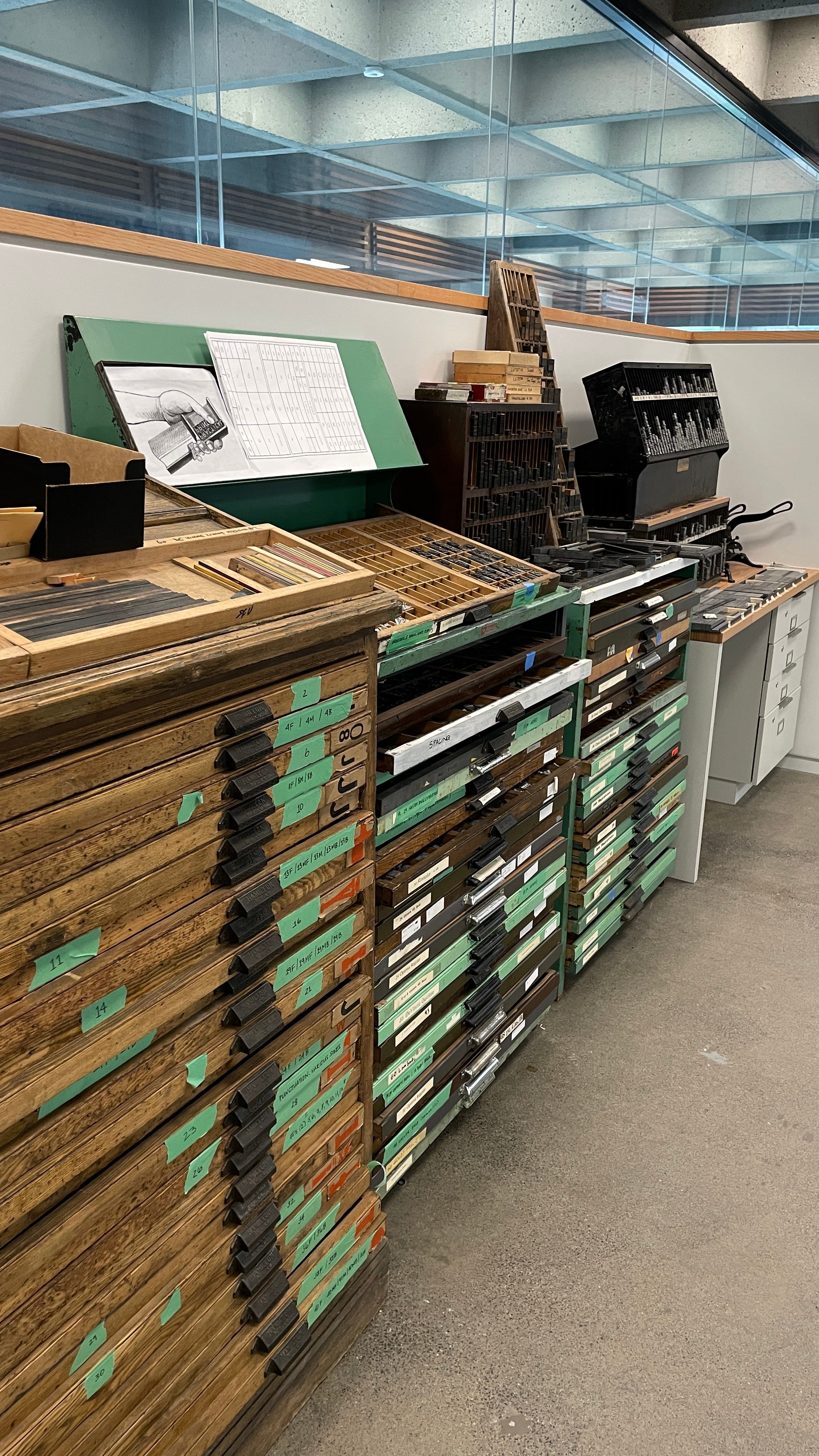
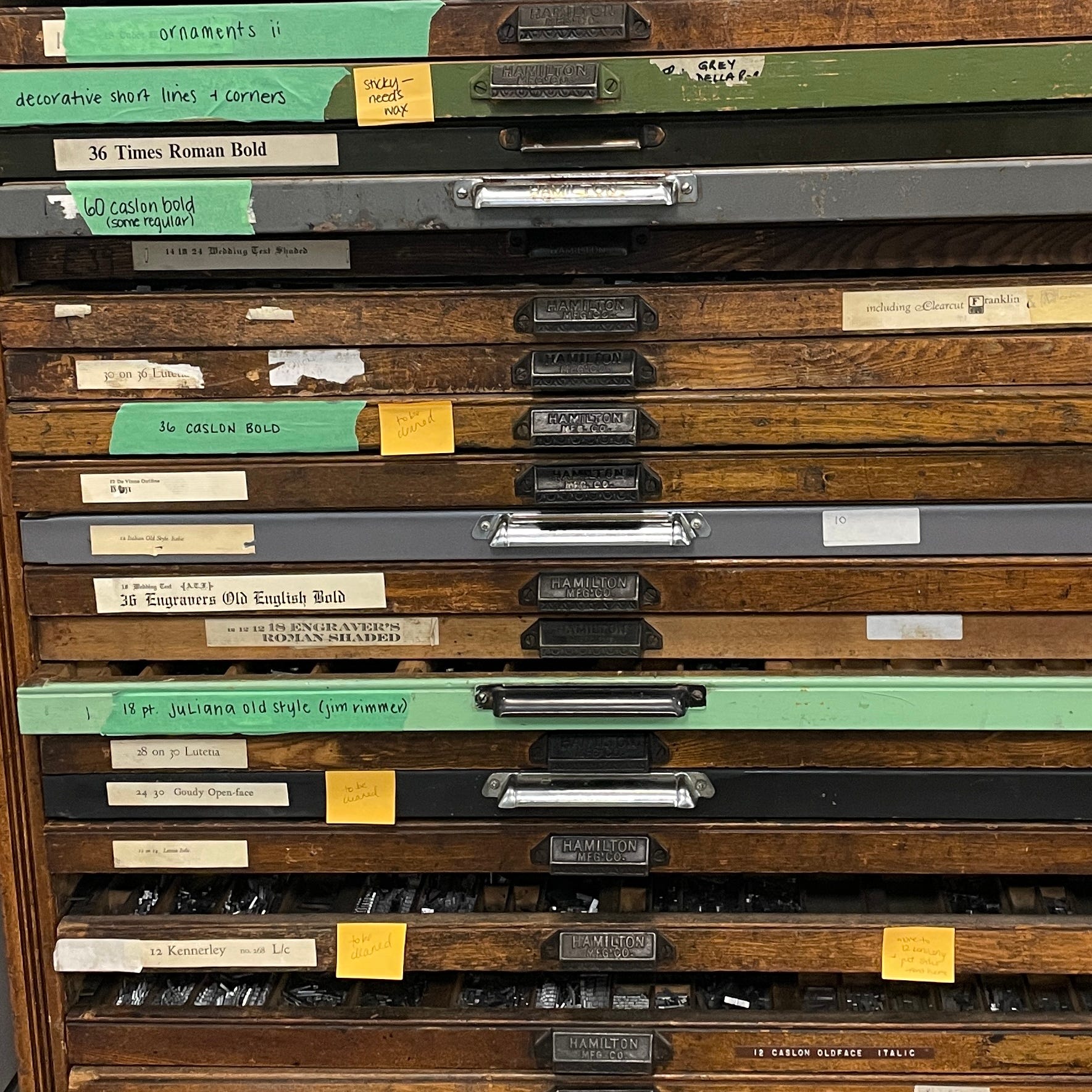
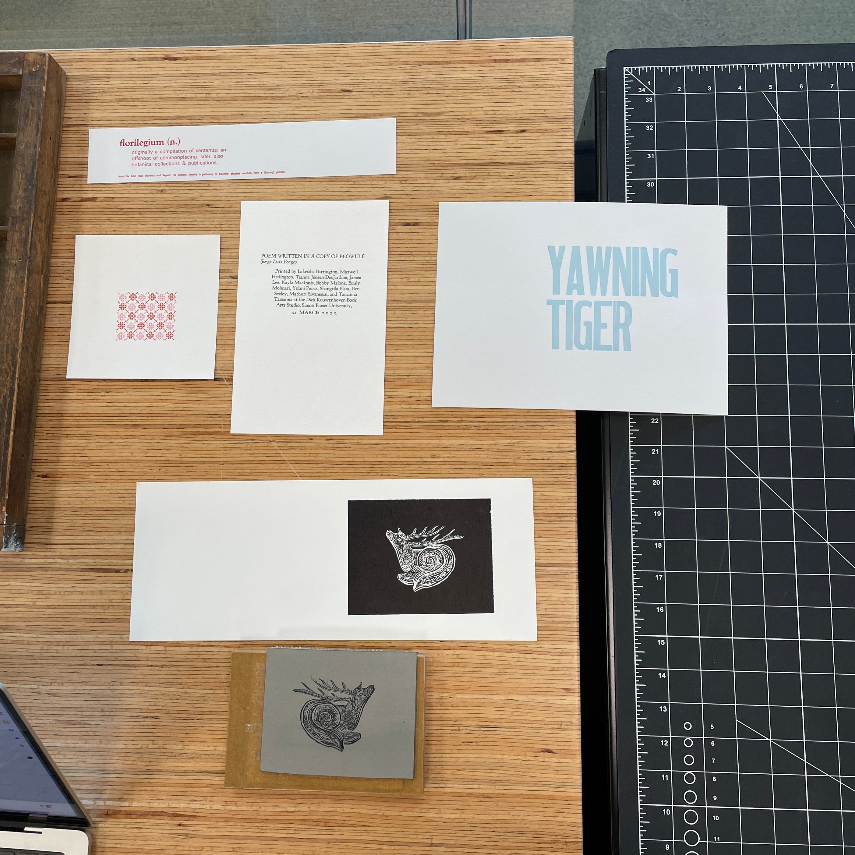
Yesterday, I worked at the SFU’s Dick Kouwenhoven Book Arts Studio, a hands‑on space in the WAC Bennett Library dedicated to letterpress printing, book history, and print culture. It’s a quietly animated place: presses lined up, typeset drawers tucked beneath tall glass windows, and the scent of ink and wood in the air.
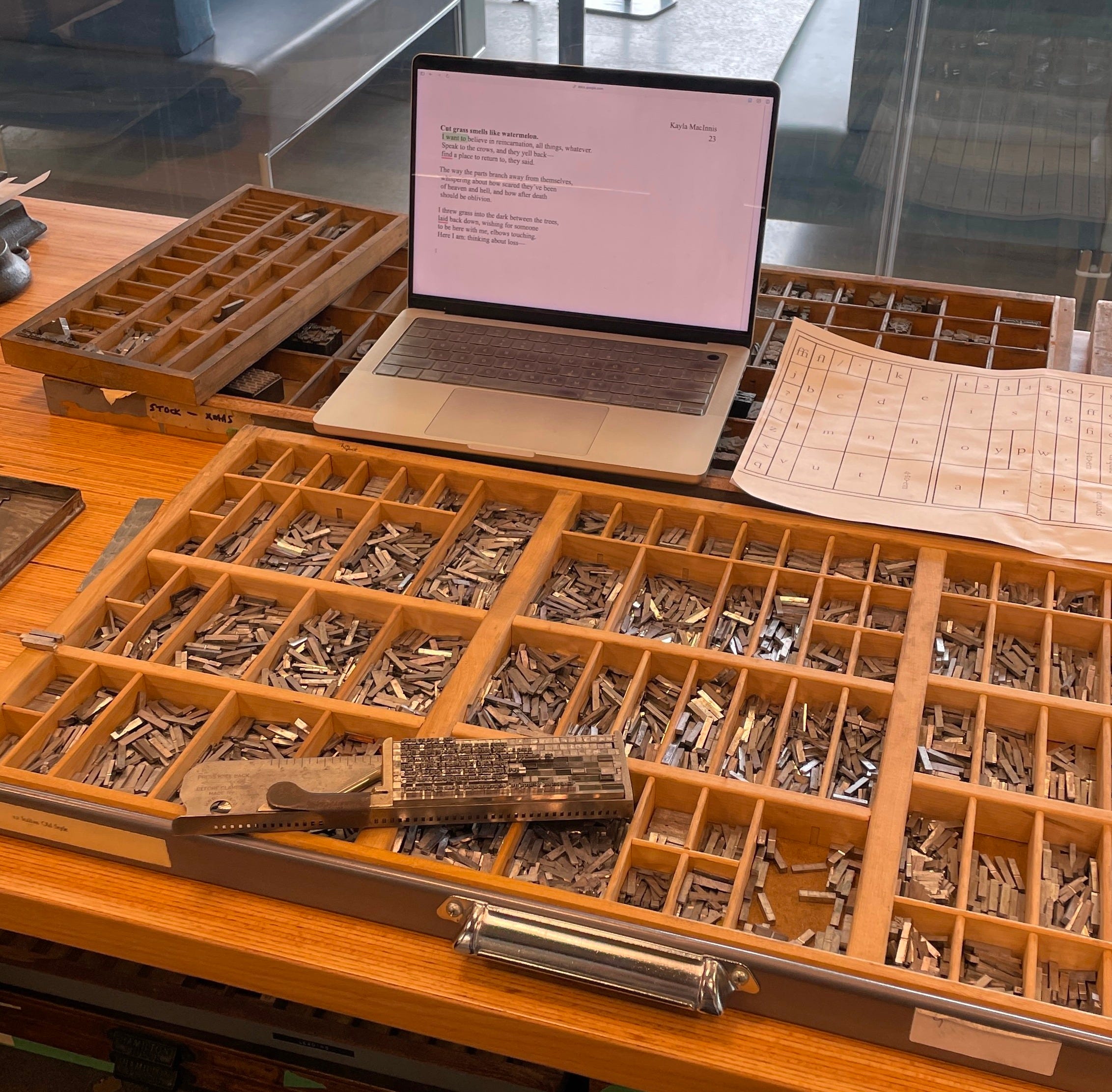
I was working with PhD student Kate Moffat, who, after walking me through everything, asked what typeface I wanted to set my poem in. I told her I tend toward serifs (Garamond, usually), the kind of face that feels timeless and classic. Sadly, there weren’t enough pieces for Garamond, so we settled on an Italian typeface she pulled from the California job case (a wooden drawer used to store movable type).
I’ve loved typography for as long as I can remember. Not just fonts, but the shape of letters, the weight of a lowercase ‘g,’ the slight tension in a well-spaced em dash. I notice the kerning in menus, the softness of a serif in old novels, the way certain typefaces seem to hold tone before a single word is read. That love for form is what first drew me to SAD Mag, to journalism, to the idea of writing in print. I studied graphic design over the years, worked on the yearbook in high school, and imagined myself laying out magazines, arranging spreads, adjusting whitespace. I never got to do layout at SAD or in school, but I’ve always hoped to. As much as I adore being a writer, design has also always been part of how I think.
When I sat down to begin, Kate handed me the printed layout that accompanied it—a typographic geography, a kind of map to help me understand where each letter lived. The letters in the job case weren’t organized A to Z, but by frequency, by muscle memory, by the natural reach of the right hand. The ‘e’ had the largest home, center-left, generous, anchoring. And ‘k,’ the first of my name, was tucked into a tiny box along the far edge, a narrow room, a quiet one. I kept thinking about how the letter that begins my life lives so small here. And how ‘e’ never needs to assert itself to be essential. It just is—a structural vowel.
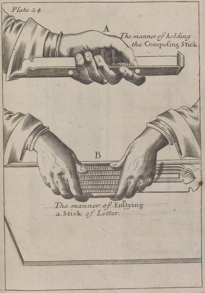
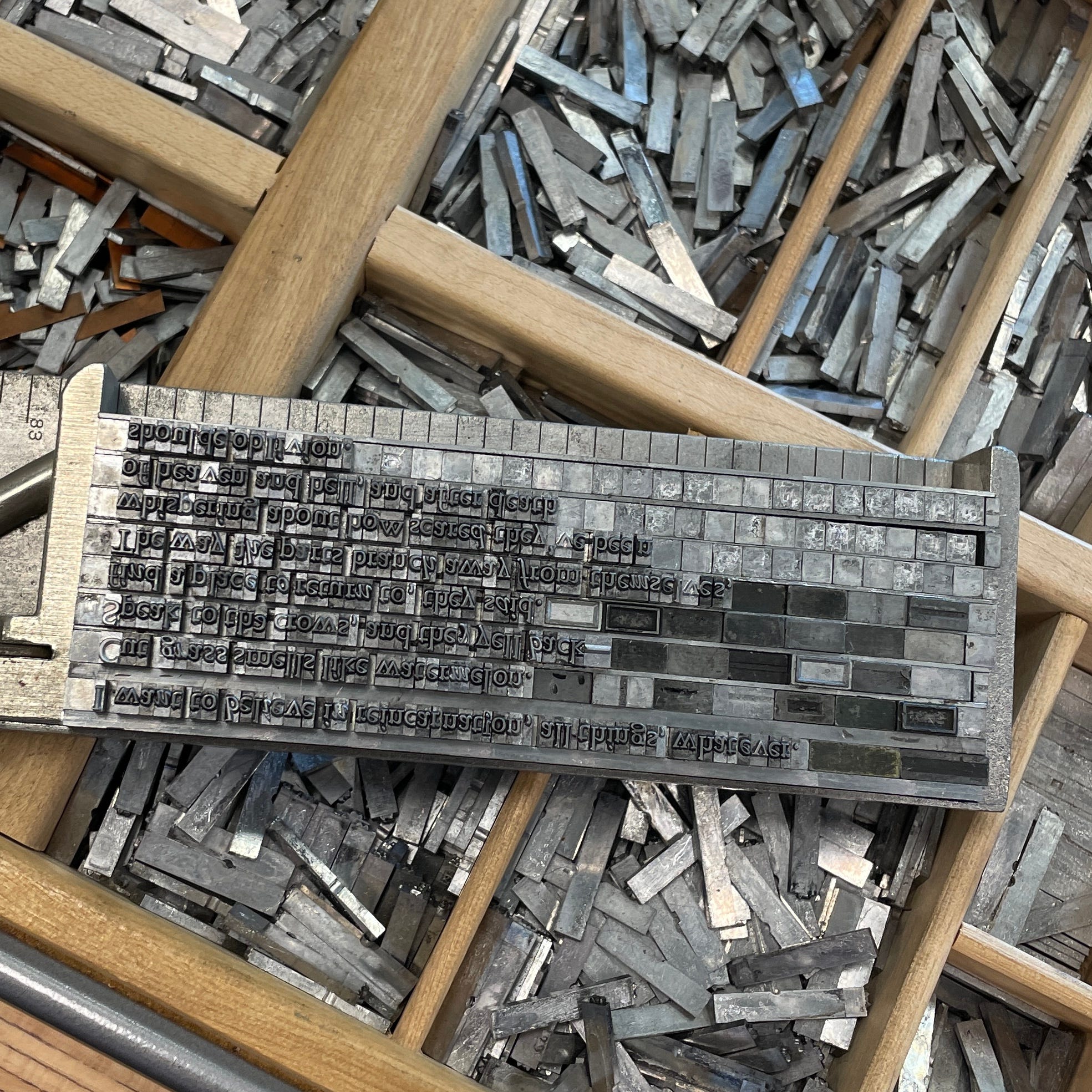
I reached over the case and ran my fingers through the compartments. Each one crowded with pieces of metal type, some stained with old ink, some dulled from use. Each letter a sliver of thought rendered solid. I pulled them one by one and began to set the poem into a composing stick. The composing stick is where your words begin to take shape—a small metal tray that’s adjustable and held like a tool or a question. You build the line backwards and upside down, setting each letter by hand, left to right, knowing it will print in reverse, orientation bent.
I had to feel my way through this process as it didn’t feel like writing as much as it did like assembling. Between each line, I slid in strips of lead, called leading. Leading comes from lead and refers to the soft metal once used to place space between lines of type. It is literally a strip of weight slid between rows to keep them from collapsing. But the word has drifted and sometimes carries a second meaning: to lead, as if space itself could offer direction, hold something open. Space isn’t absence as much as it’s architecture. Even now, in design software like InDesign, Photoshop, or Word, the term remains.
Kate and I measured the longest line of my poem with a pica ruler, a printing measure still used in Photoshop and InDesign. One pica equals twelve points; six make an inch. The line came to thirty picas, so we adjusted the composing stick to match. It took me two hours to set half the poem. The process was unfamiliar, almost disorienting. Something about it reminded me of sign painting, how those artists work in reverse on glass, painting the outlines and shadows first, the surface last. I had to build each line backwards and upside down, constantly second-guessing whether a letter was facing the right way or if I’d reached for the right size of spacer. I kept losing track of where I was in the sentence. Something about working in reverse disrupted the usual rhythm of language; it made my thinking visible, awkward, and mechanical. Every word felt earned.

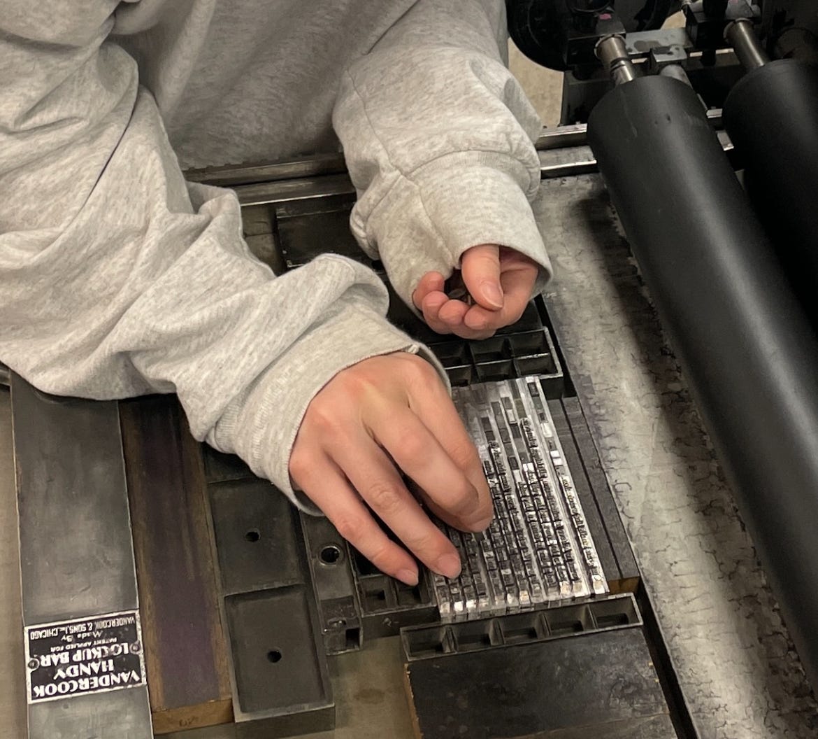
Afterward, my friend and fellow MA/PhD cohort member Tianne showed me how to roll the ink. I loaded the brayer (a small handheld roller used to apply ink), then made thick, slow passes until the ink caught on the raised surfaces of the type. We locked the forme (the assembled lines of metal type) into the bed of the Vandercook press (a mid-20th-century flatbed proofing press still prized for its precision and reliability).
To keep everything in place, we used furniture (wooden or metal blocks that fill the empty space around the type) and tightened it all with quoins (small expandable wedges). A quoin key, a specialized tool, turns the quoins until the forme is firmly held. Then I pulled the lever. The press exhaled a low, mechanical sigh. The paper passed through, and when I lifted it, my poem was there, impressed into the page. I smiled with my whole body.
I was amazed at how this poem was no longer something I thought. It was something I built. Bent over the case. Ink on my fingers. Pressure in my shoulders and wrists. The drag of metal. The scent of solvent and wood. The composing stick grew heavier with each line I set, words accumulating not just meaning, but mass. I felt the literal weight of language in my hand, a gravity I hadn’t known on the screen, a meditative practice that pulled me out of abstraction and into sensation.
What struck me most was how deeply physical the whole thing was, how cognition seemed to shift. I moved out of my head and into my wrist, into the grip, the shoulder, the subtle calibrations of pressure and space. It reminded me that language can also be structural, spatial, and rhythmic. This felt connected to the kind of research I’m doing, on how knowledge is formed through movement, repetition, and friction.
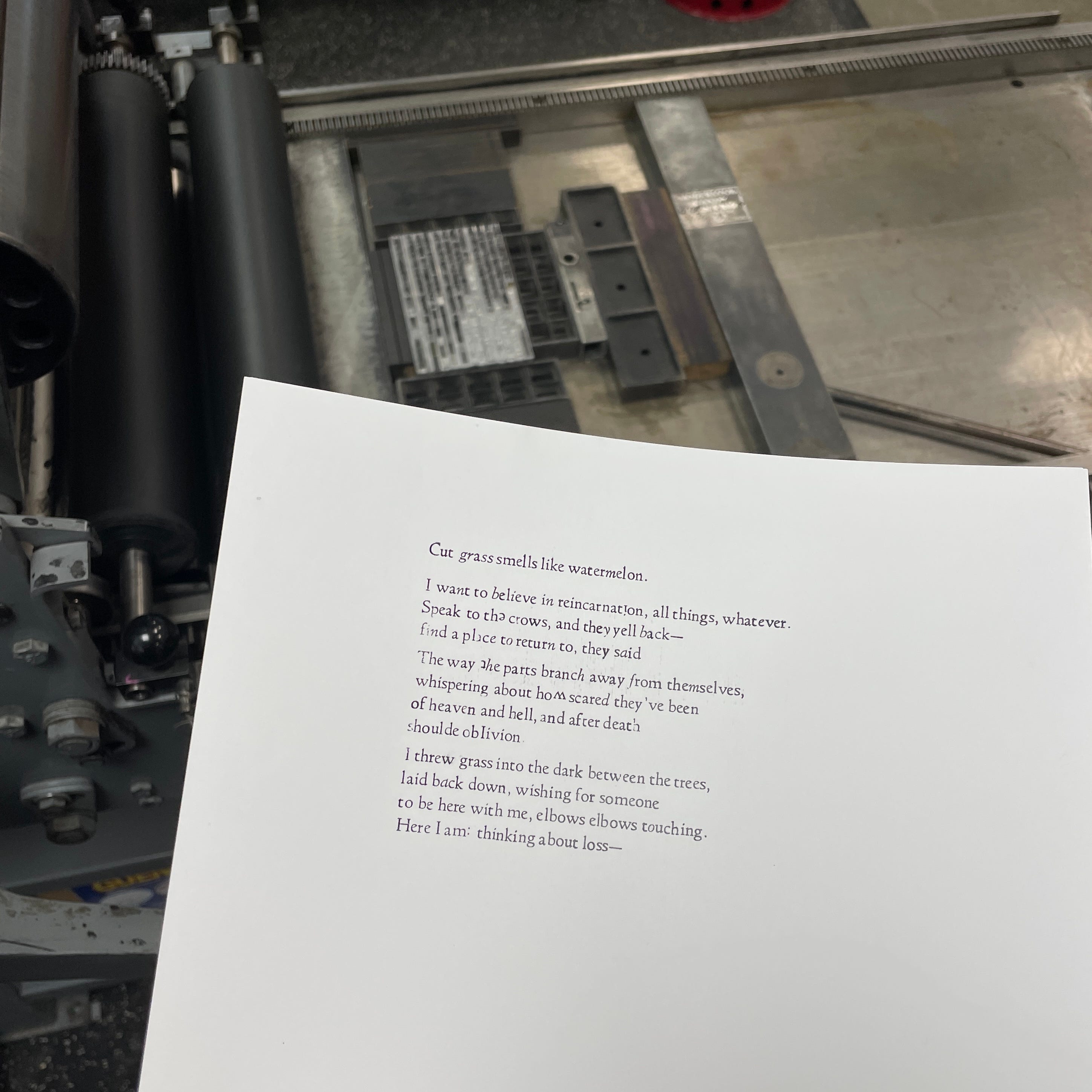
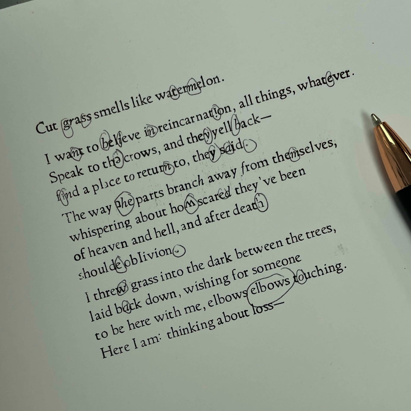
There were a bunch of mistakes in my poem; some letters were italic because someone had mixed typefaces in the case, and I missed a few words or accidentally repeated them. Kate mentioned that this often happens when you’re talking while typesetting because focus drifts, and the hand forgets where the line was. I actually found the mistakes kind of fascinating. Humbling, too. I loved the upside-down letters, the doubled words. I loved the patience and attention it demanded.
To set a line of type is to borrow time from the past, to move inside a rhythm that resists urgency. Nothing about it invites speed. Even the mistakes felt temporal, traces of where attention faltered, where the hand moved faster than the mind, or forgot what it had already placed. It made the process visible in a way writing often isn’t. Each line physical held interruption, hesitation, return.
In a culture of scale and speed, there’s something subversive about a hand-bound object that takes hours to make and lives quietly in someone’s bag or drawer. I wasn’t able to finish because we ran out of time, but now that I’ve proofed my first print, we can go back and correct everything manually. That, too, is part of the process, returning, re-entering, aligning thought with form.
While doing all of this work I thought about how it sits at the intersection of my SSHRC-supported research on embodiment and phenomenology and my recent interest in the material histories of print. I reached out to a professor about a creative-critical Directed Study that brings poetics into dialogue with print culture and book history.
What I am hoping to do is a practice-based project that explores how zines and artist books, particularly those grounded in feminist and decolonial traditions, create space for affective, embodied knowledge. My plan is to create a handmade book or zine of poems, accompanied by a reflective essay that traces the process, exploring how the physical life of a book influences the way we write, read, and relate to the body. I’ve been imagining something small-scale and handmade, in the spirit of presses like Ethel, where the form becomes part of the reading experience, and where poetics, embodiment, and materiality are in conversation from start to finish.
Kate was such a generous instructor, so knowledgeable, enthusiastic, and kind. She walked me through each tool and its history, each strange little quirk of the studio, with a kind of reverence that made everything feel alive. I’m already looking forward to next time: learning how to set block letters (the larger ones made from wood), being taught how to linocut (I designed a little crow to be stamped at the bottom of my poem that I plan to carve), and exploring the drawers of ornamental design stamps (tiny flourishes with long histories). I’m curious, too, about experimenting with pressure and paper texture, playing with multiple ink colours, or even binding my own chapbook by hand. There are so many ways to let the press seep into my work in a physical way. I’m excited to get out of my head and into my body!!
If you ever get the chance, hold a composing stick. Feel what it means to build a sentence by hand. It will change you, I swear.
Until next time,
Kay
I love that you saw through your letterpress experience that text has a physical and spatial presence. So much of "good" typography rests upon that idea.
Also, I'm always happy to see others introduced to this dying craft. It's such a great way to make tactile, physical typographic artifacts and it has amazing connections to our history.
Thank you for sharing your experience!